ggplot Shapes in R to Create Scatter Plots
Learn to use ggplot shapes in R to create beautiful and informative scatter plots with different point shapes, colors, sizes, and fills.
Read the Complete Article and download the code:
Explore Our Tutorials and Solved Examples on Our Data Analysis website.
- Join Our Community and Stay Updated with recent trends of Data Analysis
- Seeking Professional Coding Assistance? Elevate Your Projects with Our Expertise!
KeyPoints
- ggplot shapes represent the points in a scatter plot, and they can be used to distinguish different groups of data, highlight outliers, or add more information to the plot.
- We can use 25 different ggplot shapes, ranging from simple circles and squares to more complex shapes like stars and triangles. We can customize the shapes, colors, sizes, and fill to suit our needs.
- We can map a variable to the shape of the points using the aes() function, which will create a different point shape for each variable level and add a legend to the plot.
- We can use geom_jitter() and geom_count() to deal with overplotting, which occurs when there are too many points in the plot that overlap with each other. geom_jitter() adds a small amount of random noise to the x and y coordinates of the points, and geom_count() adds points with sizes proportional to the number of observations at each position.
- We can use geom_smooth() to add a regression line and a confidence interval to the plot, which can help to show the trend and the uncertainty of the relationship between the variables. Using the level argument, you can use different regression models, such as linear or loess, and control the confidence level.

Before We start, Make sure you read the following:
- Comprehensive Guide: How to install RStudio
- How to Import and Install Packages in R: A Comprehensive Guide
- No interest in Coding? Try our Shiny Apps
Setting the Stage: Basic Scatter Plot
Let’s kick off our journey by building a strong foundation. Creating a basic scatter plot involves utilizing the ggplot() function and specifying the aesthetics. Here’s a snippet of code to get you started:
##                    mpg cyl disp  hp drat    wt  qsec vs am gear carb
## Mazda RX4         21.0   6  160 110 3.90 2.620 16.46  0  1    4    4
## Mazda RX4 Wag     21.0   6  160 110 3.90 2.875 17.02  0  1    4    4
## Datsun 710        22.8   4  108  93 3.85 2.320 18.61  1  1    4    1
## Hornet 4 Drive    21.4   6  258 110 3.08 3.215 19.44  1  0    3    1
## Hornet Sportabout 18.7   8  360 175 3.15 3.440 17.02  0  0    3    2
## Valiant           18.1   6  225 105 2.76 3.460 20.22  1  0    3    1
Assigning Specific Point Shapes
Further customization involves assigning specific point shapes to distinct levels of cylinders:

People Love to Read
- How do I customize my ggplot2 graphs?
- How I Chose Between Bar Graphs vs Histogram for My PhD Article
- ggplot2 multiple plots in R
- Say Goodbye to Coding Complex Graphs: Explore the User-Friendly ggplot2-Shiny Combo
- Exploring R Date Format Complexities: My Doctoral Insights
- How to create a correlation heatmap in R [Update 2023]
- How to Calculate Confidence Intervals in R?
- How to Analyze Data in R: A Beginner’s Guide
- Exploratory Data Analysis for International Journals -PhD Insight
- ggplot2: Guide to Data Visualization
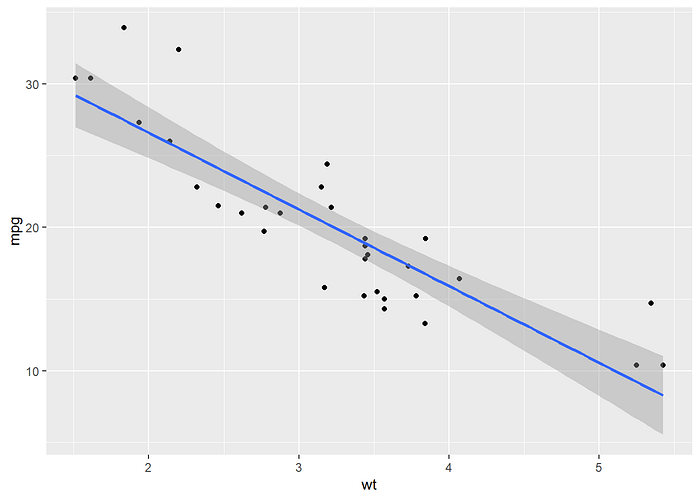
Adding Regression Lines and Confidence Intervals
Moving towards more advanced analytics, include linear regression lines and confidence intervals:
People Also Read:
- How I Create Violin Plots with ggplot2 in R
- How do I customize my ggplot2 graphs?
- How I Chose Between Bar Graphs vs Histogram for My PhD Article
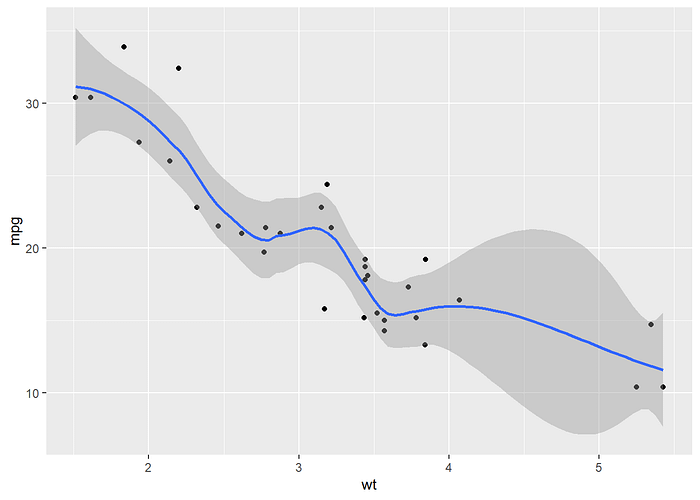
Using Loess Models for Smoothing
For a smoother representation of trends, employ loess models with a specified degree of smoothing:
People Also Read:
- Air Quality Index (AQI) and World Future 2025?
- Case Study: Unraveling Russia’s War Efforts in Ukraine
- ggplot2: Guide to Data Visualization
Labeling Points and Adding Text
To make your scatter plot more informative, consider labeling data points with the names of corresponding cars:

Please find us on Social Media and help us grow
- Facebook: https://www.facebook.com/DataAnalysis03
- Instagram: https://www.instagram.com/dataanalysis03/
- Twitter: https://www.twitter.com/Zubair01469079/
- Youtube: https://www.youtube.com/@data.03?sub-confirmation=1
- Tiktok: https://www.tiktok.com/@dataanalysis03
- Whatsapp Community: https://chat.whatsapp.com/IGjjvZVsGCiLn5jSmrFQaJ
- Whatsapp Channel: https://whatsapp.com/channel/0029VaBzfy80G0XbCXhGGA16
- Telegram Channel: https://t.me/dataanalysis03
- Medium: https://data03.medium.com/
- Quora: https://www.quora.com/profile/Muhammad-Zubair-Ishaq
- Google News: https://news.google.com/publications/CAAqBwgKMIaV0QswxbDoAw?hl=en-PK&gl=PK&ceid=PK%3Aen