How to create a correlation heatmap in R [Update 2023]
A correlation heatmap is a type of plot displaying the correlation coefficients.

Hi, I’m Zubair Goraya, a Certified data analyst and a writer for Data Analysis, a website that provides tutorials related to RStudio. In this article, I will show you how to create a correlation heatmap in R, a powerful and popular data analysis and visualization programming language.
A correlation heatmap is a plot displaying the correlation coefficients between variables in a data frame. It is useful for exploring the relationships between variables, identifying potential patterns, and finding outliers. A correlation heatmap can also help you select the most relevant variables for your analysis and avoid multicollinearity problems.
In this article, I will use the ggplot2 package, one of the most widely used packages for data visualization in R. I will also use the mtcars data set, which contains information about 32 cars from a 1974 Motor Trend magazine.
By the end of this article, you can create a beautiful and informative correlation heatmap for your own data set.
What is a correlation coefficient?
A correlation coefficient is a numerical measure of the strength and direction of the linear relationship between two variables. It ranges from -1 to 1, where -1 indicates a perfect negative correlation, 0 shows no correlation, and 1 indicates a perfect positive correlation.
A correlation coefficient can be calculated using different methods, such as Pearson’s r, Spearman’s rho, or Kendall’s tau.
In this article, I will use Pearson’s r, the most common method for continuous variables. Pearson’s r is defined as:
What is a correlation matrix?
A correlation matrix is a square matrix containing the correlation coefficients between all variables in a data frame. It has the same number of rows and columns as the number of variables and 1s on the main diagonal.
A correlation matrix can be symmetric or asymmetric, depending on whether the Order of the variables matters or not.
For example, here is a correlation matrix for the mtcars data set:
As you can see, the correlation matrix shows the correlation coefficients between all pairs of variables in the mtcars data set. For example, the coefficient between mpg and cyl is -0.85, indicating a strong negative correlation between miles per gallon and the number of cylinders.
Before you start make sure you have:
How to create a correlation heatmap in R?
To create a correlation heatmap in R, you need to follow these steps
Load the ggplot2 package and the mtcars data set.
Calculate the correlation matrix for the mtcars data set using the cor() function.
Reshape the correlation matrix into a long format using the melt() function from the reshape2 package.
Create a basic heatmap using the ggplot() function and the geom_tile() function, mapping the x and y variables to var1 and var2 and the fill variable to value.
Text labels in the heatmap
Add text labels to show the correlation coefficients using the geom_text() function, mapping the x, y, and label variables to var1, var2, and value.
Adjust the color scale
Adjust the color scale to show a gradient from blue (low correlation) to red (high correlation) using the scale_fill_gradient2() function.
Remove the upper triangle.
Remove the upper triangle of the heatmap to avoid redundancy using the filter function from dplyr library.
Read More about dplyr library:
Remove the upper triangle
Remove the upper triangle of the heatmap to avoid redundancy using the filter function from dplyr library.
Heatmap Customization
Remove the background, grid lines
Remove the background, grid lines, and axis titles using the theme() function and set various elements blank.
Add a title and a caption.
Add a title and a caption to your plot using the ggtitle() and labs() functions.
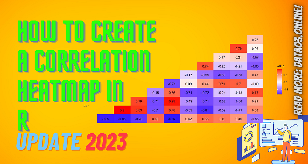
As you can see, the plot shows a correlation heatmap for the mtcars data set, with the lower triangle showing the correlation coefficients between pairs of variables. The color scale ranges from blue (low correlation) to red (high correlation), and the text labels show the rounded values of the coefficients. The plot has no background, grid lines, axis titles and a title and caption describing the data’s source.
Pros and Cons
Some advantages of correlation heatmaps are
Some disadvantages of correlation heatmaps are
When and Why
Conclusion
I have shown you how to create a correlation heatmap in R using the ggplot2 package and the mtcars data set in this article. A correlation heatmap is a plot displaying the correlation coefficients between variables in a data frame. It helps explore the relationships between variables, identify potential patterns, and find outliers.
To create a correlation heatmap in R, you need to calculate the correlation matrix using the `cor()` function, reshape it into a long format using the `melt()` function, create a basic heatmap using the `ggplot()` and `geom_tile()` functions, add text labels using the `geom_text()` function, adjust the color scale using the `scale_fill_gradient2()` function, remove the upper triangle using the `subset()` argument, remove the background, grid lines, and axis titles using the `theme()` function, and add a title and a caption using the `ggtitle()` and `labs()` functions.
I hope you have enjoyed this article and learned something new. If you have any questions or feedback, please comment below. If you need help with your data analysis projects, contact me at contact@data03.online or hire me at Order Now.
Thank you for reading.
Read more: How to create a correlation heatmap in R [Update 2023]
Originally published at https://www.data03.online.
